Optimising your adverts for Deal Builder
Car buyers today want to complete more of their buying journey online. With this comes an expectation from your customers to see as much about the vehicle online as possible, building trust and transparency in the online process. We also know that most consumers do not want to purchase a car purely online and so the hand-off to and the role of the retailer is still crucial, shifting the experience to an omni-channel retailing model; blending the best of online and offline experiences to whatever the customer needs.
Our latest update to your adverts aims to build this confidence for your customers, providing them with all the information and assurance they need to take that next step. We’ll be actively and closely monitoring the updates to measure their effectiveness on performance and will continue to evolve as we learn more. As always we welcome your feedback on these changes, so if you have any thoughts, please reach out to your account manager.
We have optimised your adverts to steer browsers towards the Deal Builder journey
Full details of the changes are below:
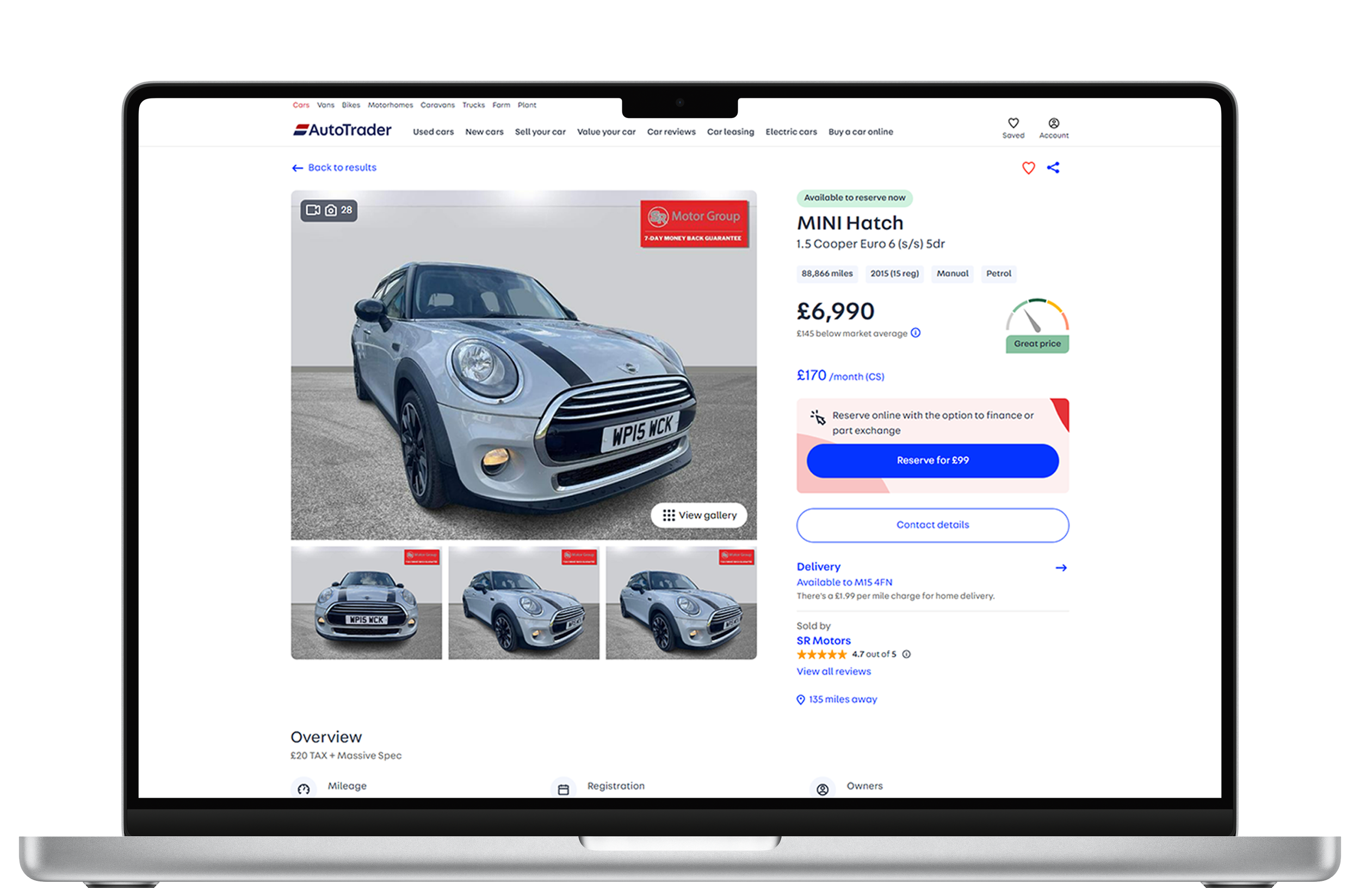
Images are mock-ups only
Updated image gallery
We’ve put more focus on the vehicle and introduced a new improved image gallery to help buyers to experience your car online as well as an improved call to action to prompt buyers to reserve the vehicle.
Why are we making this change?
Buyers have told us that inspecting images of the vehicle is essential for them before they can feel confident this is the vehicle for them. This includes easier access to video’s and 360 spins too. The improved CTA also aims to increase conversions when buyers come to your adverts.
Quick links
We’ve added quick links at the top of the advert page, underneath the “reserve for £99” button signposting the key jobs your buyers need to complete before starting their purchase.
Why are we making this change?
By introducing an improved design, we can take your buyers on a journey through the key information, ensuring they are fully informed when they take that next step.
New infographics
We’ve introduced eye-catching graphics throughout the advert page, outlining the Deal Builder steps to your browsers and guiding them towards completing the process
Why are we making this change?
This is designed to give buyers confidence in the process, reassurance in the level of control they have, as well as making it clear that they can do as much or as little online as they like.
Unifying the contact options
We’re bringing your other contact options into one convenient place. ‘Contact details’ and ‘Seller profile’ will now all be accessible within the ‘About this seller’ section of your adverts
Why are we making this change?
With multiple possible next steps from the existing advert page, we’ve found that buyers could suffer from choice paralysis. We’ve consolidated these options into one place to enhance the consumer journey on your adverts.
Before the improvements to the advert:
After the improvements to the advert:
These improvements are designed to provide greater efficiency within your operation and will be carefully monitored once they are released. The changes are the latest in a series of updates we will be making to enhance the buying journey and give your customers the confidence they need to transact via Deal Builder.


